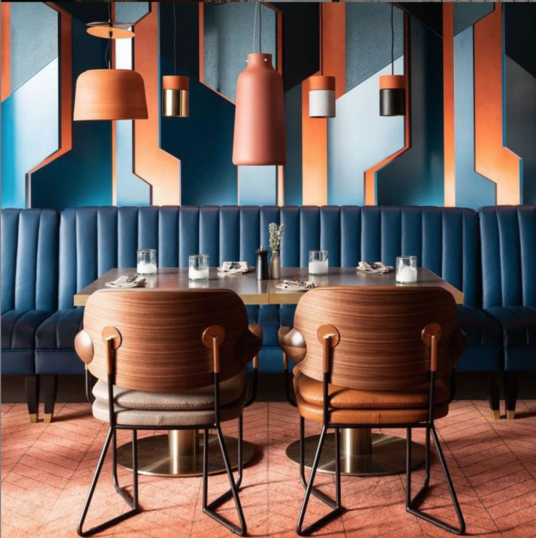
Every December since 2000, the Pantone Colour Institute has selected a “colour of the year” – a shade that they anticipate will define the world’s creative zeitgeist for the next 12 months. While it’s true that Pantone’s chosen hue goes on to dominate the creative news cycle, the question is whether this is down to some kind of objective scientific insight on the part of its research wing, or a self-fulfilling prophecy – a by-product of a creative echo-chamber that feeds of such definitive statements.
Here we dig down into the idea of a “colour of the year”: does it truly reflect a moment in time, or is it just marketing hype?
The year of orange
2019 will be the year that “Living Coral” – an orange-peach shade that, in the words of Pantone looks warm, nurturing, optimistic and natural – is set to sweep the worlds of fashion, graphic design, packaging, retail and exhibition design, furniture and more. Pantone says that the shade is a direct response to “the onslaught of technology and social media”.
Extensive research or an educated guess?
While the company publishes extensive insight into it’s chosen colour, very little is known about how it produces its list of candidates, or how that list gets shortened down to “the one”. According to Pantone, their experts “comb the world looking for new colour influences”. These influences apparently run the gamut all the way from the entertainment and film industries, through art, fashion and design, all the way to popular travel destinations, lifestyle and socio-economic trends.
Perhaps a little broad in scope when compared to other exercises in market research, but then again Pantone is clearly aiming to be in at the forefront of people’s minds whenever a splash of colour is needed – whether in interior design, retail and exhibition design or set production. This is evident in the partnerships that they have fostered to turn a recommendation into a commercial reality. Last year it was ultra-violet-coloured Beats wireless, and this year Butter nail polish is among the brands releasing a coral-coloured product.
What does it all mean?
Ok, so the process may not be totally scientific, and there is certainly a healthy amount of cynical marketing logic behind such an annual announcement. The bottom line is that Pantone has a product to sell after all, and becoming something of an oracle within the world of colour will only help them to sell that product. Perhaps they just have a large batch of ink they’d like to shift.
But, is it useful for the industries that experience its impact? Does it promote creativity or stifle it? Many designers consider it constraining, with such pronouncements serving to promote laziness, and cheapening genuine initiative that may have occurred independently but landed in the same ballpark. And of course, there are those other paint retailers that have jumped on the bandwagon. Sherwin-Williams announced Cavern Clay as their colour of 2019, Benjamin Moore chose Metropolitan, a soft grey, while Behr Paint decided on Blueprint, a vibrant teal. Can one year really capture such a rainbow of colour?
But then again, specific colours and palettes do come to dominate particular periods of time – the psychedelic shades of the sixties giving way to the muted earth tones of the seventies.
It all comes down to whether your creative or commercial interests are best served by following or bucking trends. In the former case, Pantone’s announcement serves as a helpful yardstick for a design that’s almost guaranteed to have mass appeal; in the latter designers are free to snap the stick in half and set it on fire, creating an aesthetic that actively subverts the established norms.
And hey, you only have to live with it for the next year.
Read here to find out more about the power of colour in retail and exhibition design.
