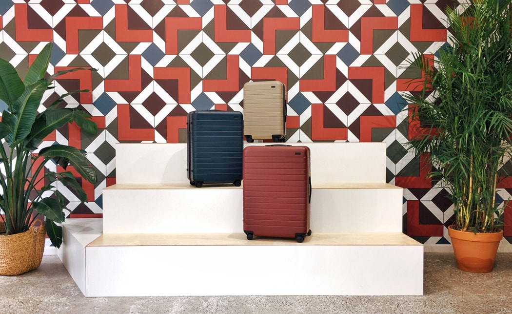
While there are many elements that contribute to successful retail design, colour may be chief among them. A study conducted by Color Communications, revealed that it takes just 90 seconds for people to make a subconscious judgement about a person, environment or product, with between 62 percent and 90 percent of that assessment being based on colour alone.
It’s an important reminder that shopping is never a purely functional experience. Rather, we approach every retail experience armed with our own aspirations, expectations, and perceptions of the world and our place within it. In short, what might seem like a casual shopping trip is an immensely complex psychological experience. And colour, more than anything else, has the power to tap into that complex tangle of psychology and communicate with our subconscious. Here are some key considerations to keep in mind when thinking about colour in retail design.
Colour and place in retail design
Colour and place are inextricably connected. While deep blue and stark white might evoke the rooftops of Santorini, terracotta and ochre can instantly conjure an image of sun-kissed Siena. These associations are powerful tools for designers, who can use them to evoke powerful synaesthetic experiences across their stores and branding.
Tanqueray gin is a great example of a brand that’s leveraged the link between colour and place. On launching its Flor de Sevilla gin, the brand partnered with Pantone to identify the colour that embodied Seville’s architecture, culture and people: the ‘Color Especial de Sevilla’. The colour took centre stage in the design of Tanqueray’s recent pop-up in Bermondsey, where the sun-filled shade was set alongside Seville oranges to create an installation evocative of the spirit of the city.
A question of culture
If you’ve spent any time planning a colour scheme, you’ve no doubt come across a neat chart that connects certain colours with emotions. Blue, for example, represents coolness, clarity and trust – traits that make it great for banks, but less effective in restaurants.
Yet it’s not quite as simple as that. Colours that can entice Western shoppers may have the opposite effect in China for example. A perfect illustration of this is the colour green, which while representing good fortune in the west, is the colour of infidelity in the China. Interestingly, this extends to our understanding of luxury. A study into the concept of ‘luxury colour’ in retail design found that US and Korean students had vastly different interpretations of colour. While Americans considered luxurious shades to be non-functional, beautiful, and pleasant, the Korean participants described more traditional colours as being high-end and exclusive.
Colour memory
If there’s one psychological phenomenon that branding experts should pay attention to, it’s colour memory. This is the idea that the more familiar a colour is, the richer and more attention-grabbing it appears. This phenomenon explains why certain colours and shades are used regularly within certain types of retail. By matching branding to customer expectations, even startup brands are able to instantly trigger recognition. That’s not to say that brands should deliberately limit their creativity when it comes to colour choice, but selecting colours that can communicate certain aspects of your offering is a powerful tool.
Staying on trend
While some colours never go out of style (think Tiffany Blue, the trademarked shade that’s become an icon of luxury), there are others that capture the zeitgeist. For those brands targeting a Gen Z audience in 2018, choosing an on-trend colour might mean incorporating elements of ‘Mellow Yellow’ – the shade pipped to become the next Millennial Pink. Or they could follow Pantone’s suggestion, and incorporate ultra-violet into their design. According to their latest trend report, this colour of the year “suggests the mysteries of the cosmos, the intrigue of what lies ahead, and the discoveries beyond where we are now.”
Colours are not connected to one emotional response – our relationships with them are far too complex to allow for such a neat reduction. The reality is that colour performs in different ways in different contexts. And while this might make the job of a retailer designer more difficult, it makes the possibilities of colour all the more exciting. Whether it’s used to evoke a sense of place, nostalgia, or capture the spirit of the zeitgeist, the power of colour in retail design should not be underestimated.
